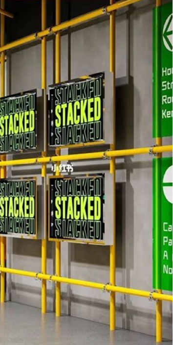
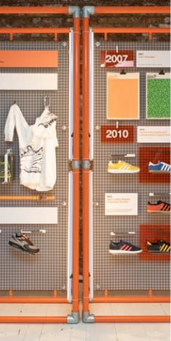
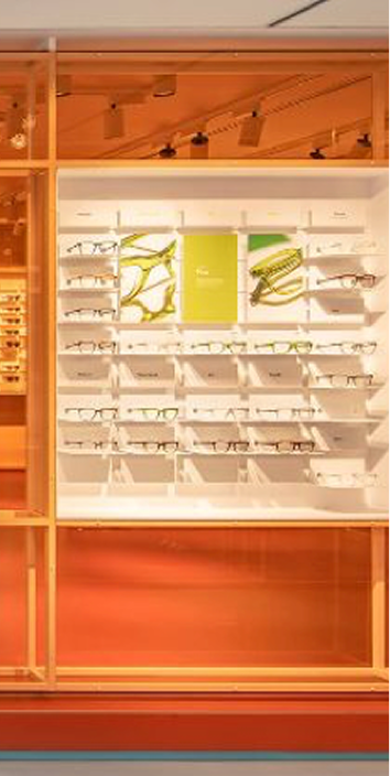
Three-Dimensional Ingredients
These are the essential elements of every activation, forming the foundation for an environment that is truly recognizable as both Grupo Tigre and Tigre.
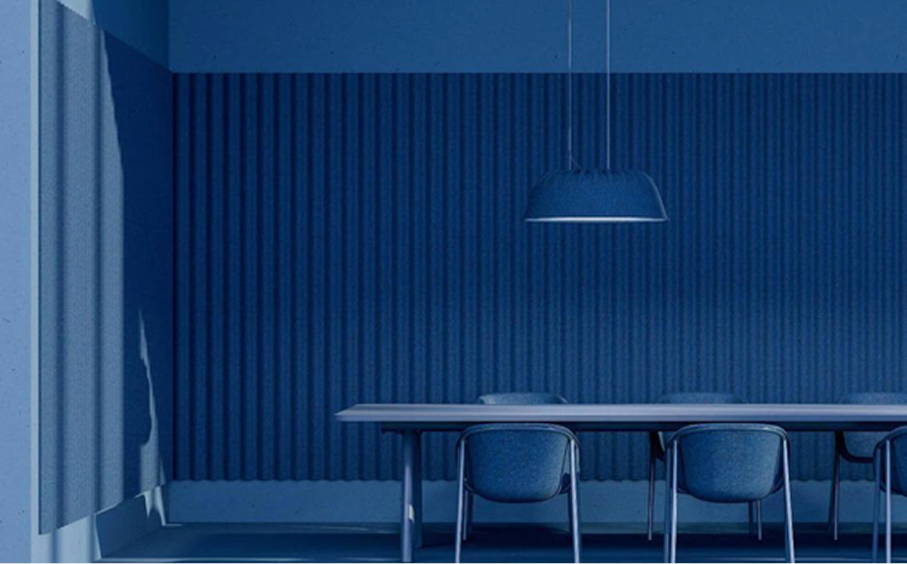
Iconic Ingredients
Honoring what makes us unique
These are the essential elements of every activation, forming the foundation for an environment that is truly recognizable as both Grupo Tigre and Tigre. Combined, these elements bring strength and visual interest to every composition, while establishing a strong focal point for recognition that captures attention and reinforces the brand's key assets.
1
Water
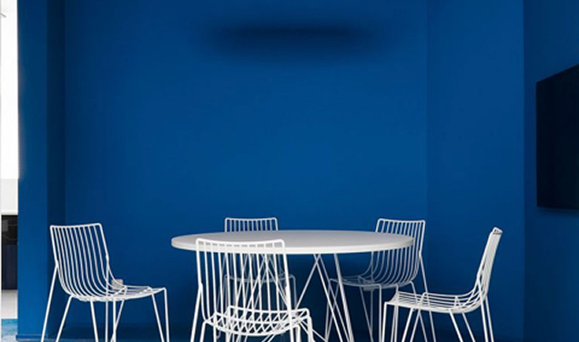
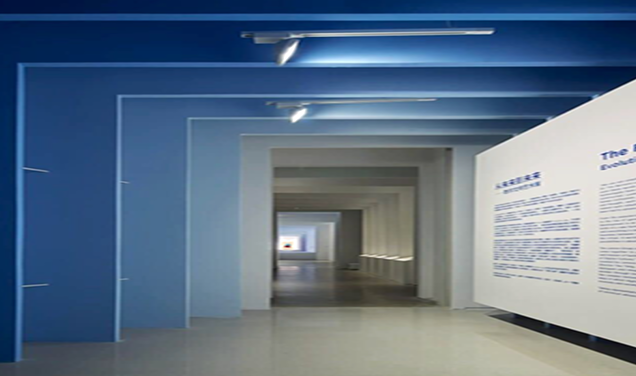
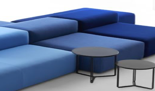
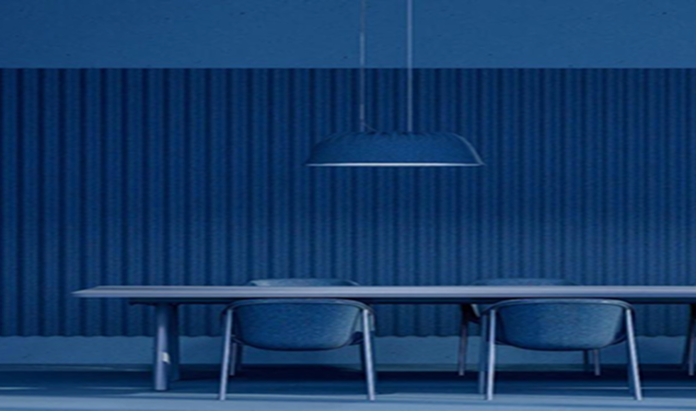
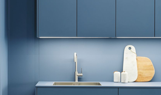

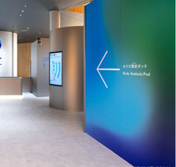

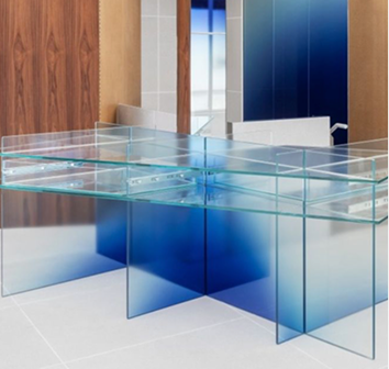
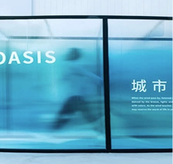
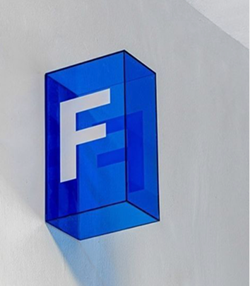
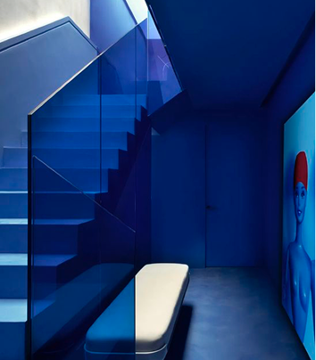
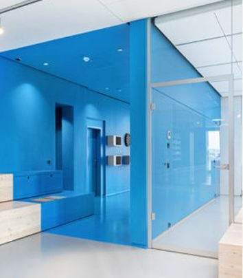



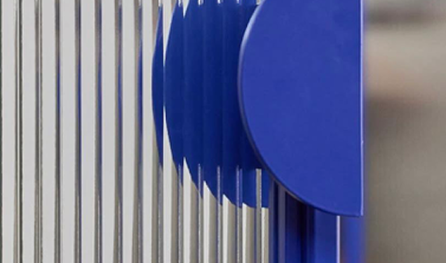

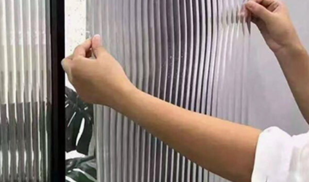
Incorrect usage
Some examples of what not to use in Tigre scenic spaces.
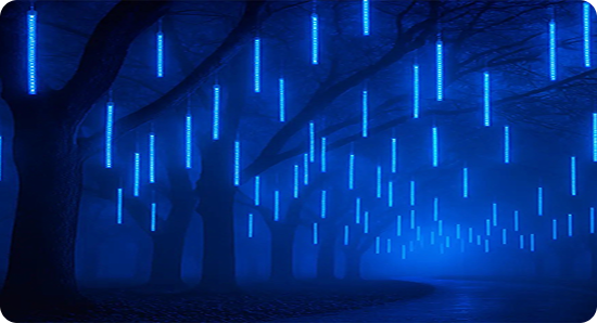

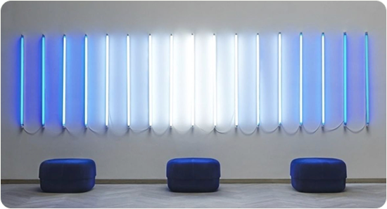


water to the next level,
with intelligence and aligned messaging


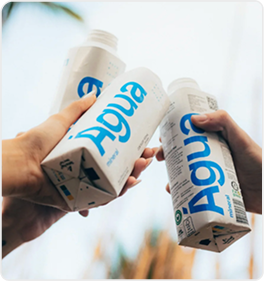
2
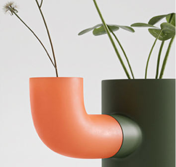
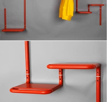
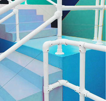
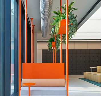
The legacy
of pipes and
fittings
compositional designs
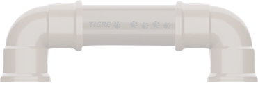







3
TIGRE
Paw
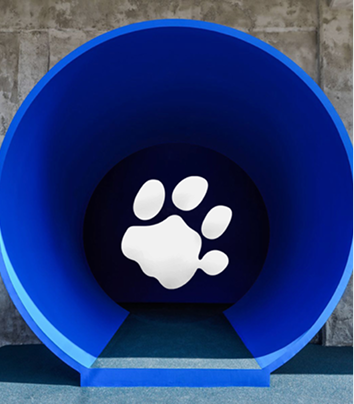
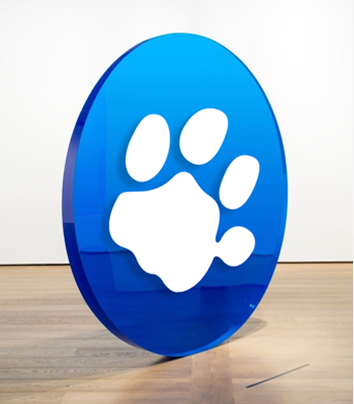
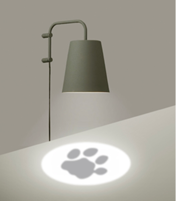
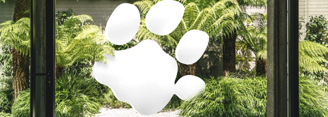
Incorrect uses
Some examples of what not to use in Tigre paw scenic spaces.
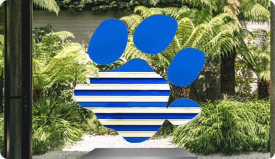
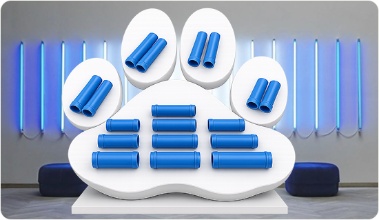
And do not alter the shape of the paw.
Ingredients
secondary
They add meaning and
reinforce personality
These are complementary elements that offer more flexibility to create innovative and distinctive compositions. They add layers of meaning and novelty, inviting the exploration of different atmospheres that elevate activations to a new level. This set of elements also provides the right tools to reflect aspects that differentiate the look & feel of Grupo Tigre de Tigre.
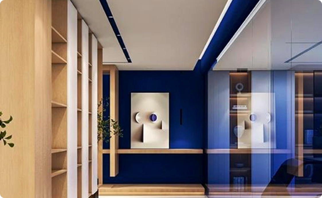
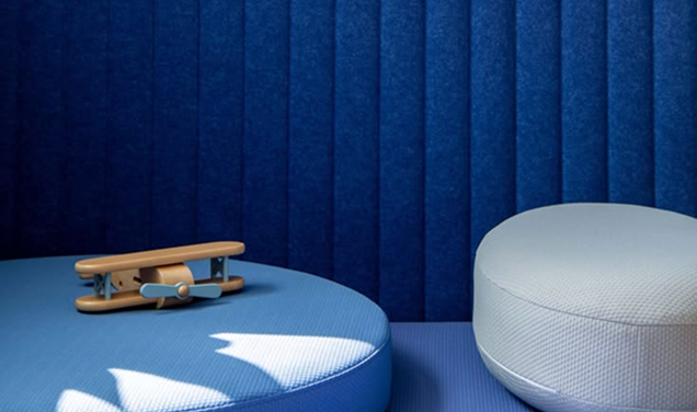
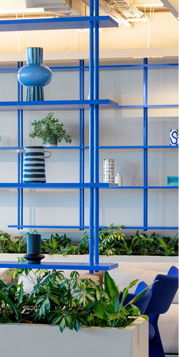
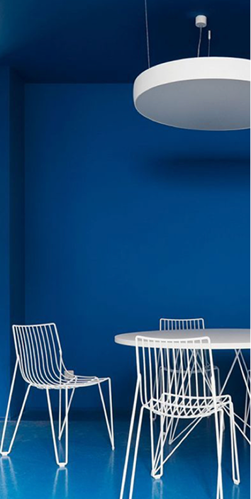
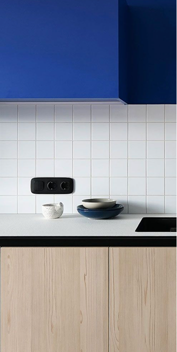
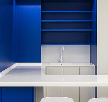
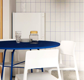
Color palettes adapted for spaces:
We adapted the visual language palettes by eliminating the darkest blue
dark and replacing off-white and sand tones with white, in addition to
of adjusting the overall proportions.
4
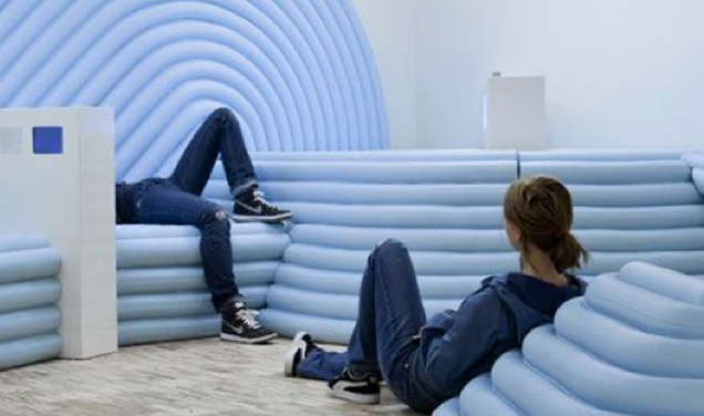
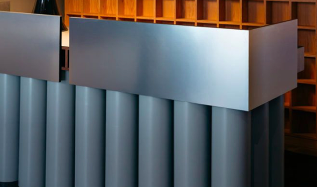
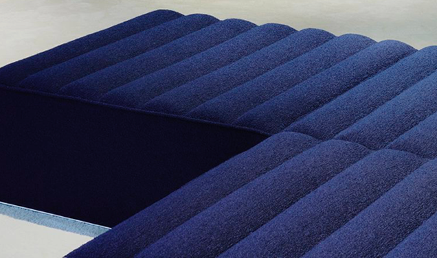
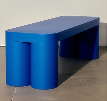
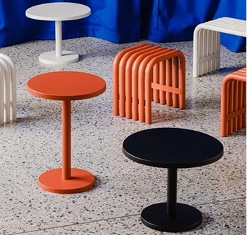
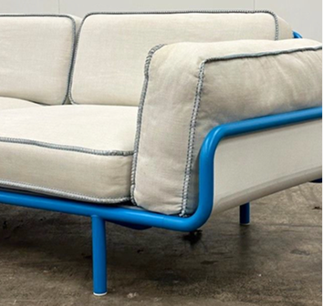
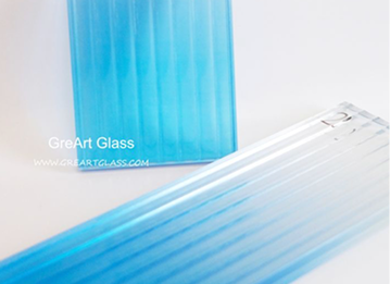
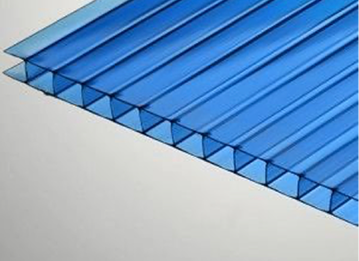
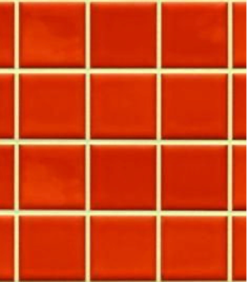
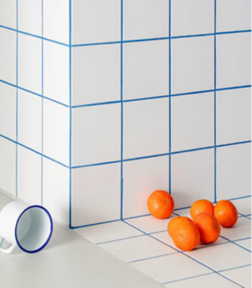
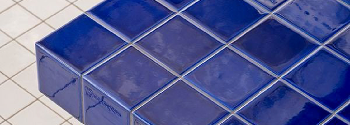
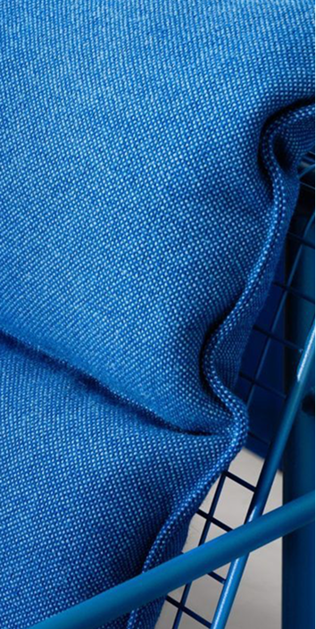
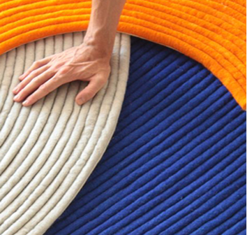
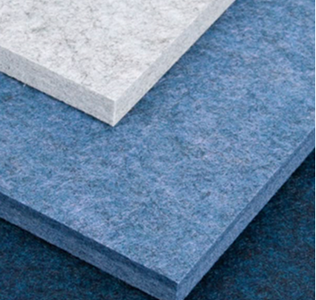
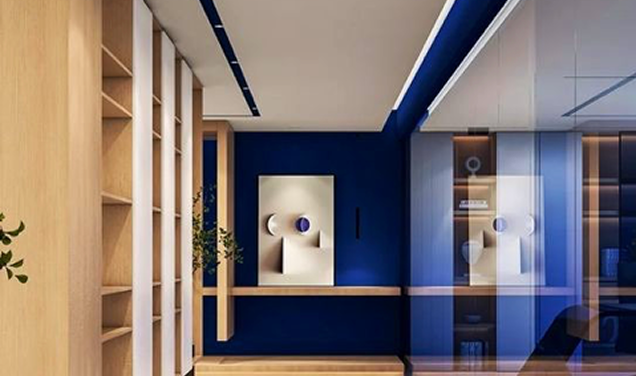
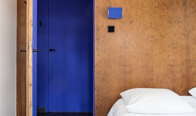
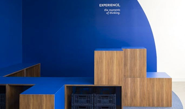
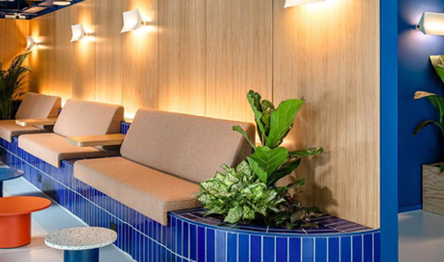
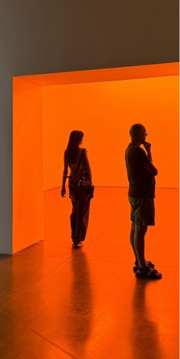
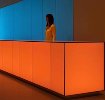
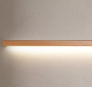
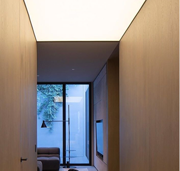
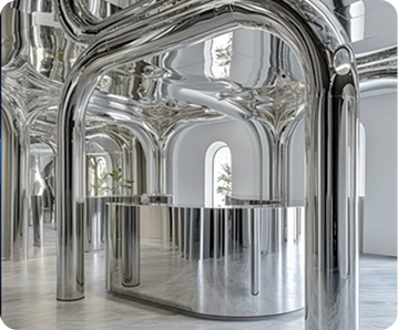
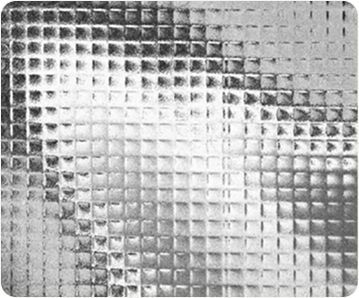
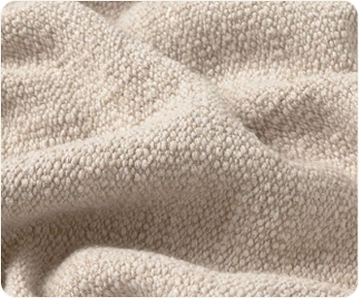
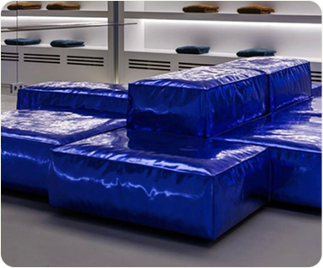
Main Materials
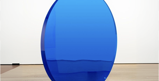
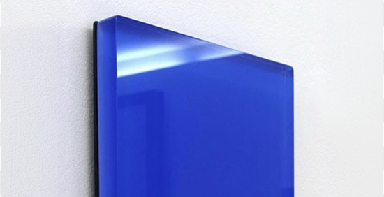






Incorrect usage
Some examples of what not to use in Tigre scenic spaces.
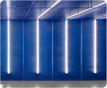

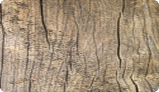
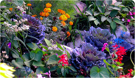
Pop-up structures
Just like in our visual language, space layouts have
a structure: the fundamental base for POP-UP compositions
for compact activations.