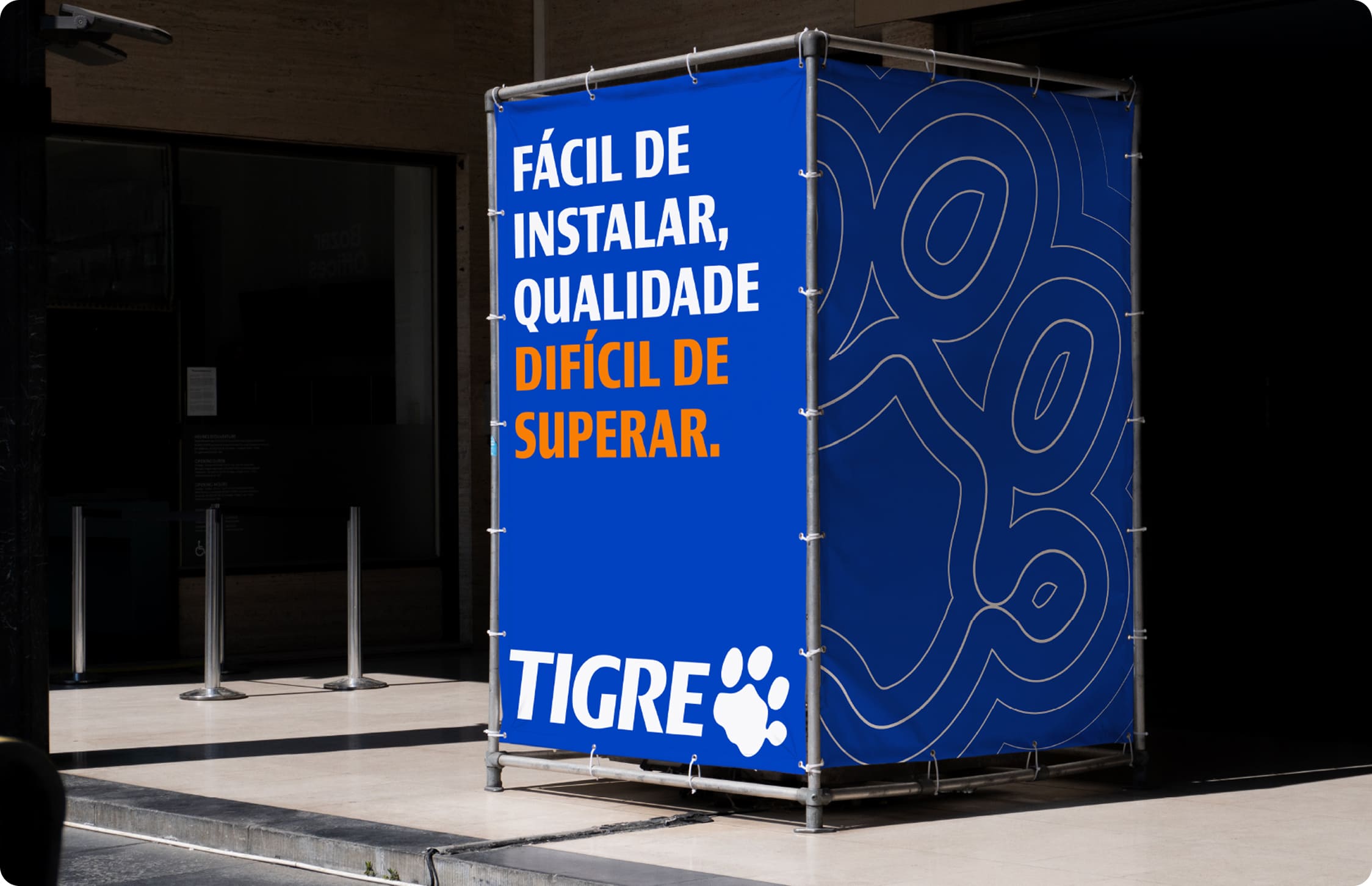
Primary palette

The brand’s primary color is Tigre Blue, and it represents trust, robustness, and credibility. Whenever possible, it should be used as the dominant color in compositions, in line with the color codes defined below:

Tigre
Blue

Copy hex code
RGB
00/70/191
HEX
#0046BF
CMYK
100, 52, 0, 0
PantoneĀ®
2728C

Secondary palette

The secondary palette complements the primary palette and brings greater flexibility to visual compositions. Its colors should be used as support, creating contrast, hierarchy, and visual variety without competing with the brand’s primary color.

Orange Tigre

Copy hex code
RGB
255/130/00
HEX
#E27F20
CMYK
0, 57, 100, 0
PantoneĀ®
151C

Sand

Copy hex code
RGB
245/240/216
HEX
#F5F0D8
CMYK
0, 3, 16, 2
PantoneĀ®
P 7-9 CM

Light Blue

Copy hex code
RGB
46/165/255
HEX
#2EA5FF
CMYK
68, 10, 0, 00
PantoneĀ®
298C

Grupo Tigre Blue

Copy hex code
RGB
00/35/117
HEX
#002375
CMYK
100, 52, 0, 37
PantoneĀ®
2147C
For printed applications, PantoneĀ® should always be used as the main color reference, regardless of substrate or printing process. Variations in paper, finish, and technique can affect color perception. That is why the Pantone reference ensures greater fidelity and visual consistency for the brand across different materials.

Color distribution

Color distribution is essential to maintaining visual balance and information hierarchy. The primary palette should predominate, while secondary colors should be applied selectively and strategically.

Grupo Tigre blue

14%

Tigre blue

40%

lighT bluE

6%

tigre orange

20%

sand

20%

Brand Center

This is a comprehensive guide to how the Tigre brand communicates and is applied through verbal and visual language guidelines.