Graphic Elements
Tigre’s graphic elements expand the brand’s visual identity and reinforce recognition, dynamism, and consistency across product applications. They act as extensions of the brand, complementing the logo and typography and helping create a distinctive visual system that is easily recognizable in different contexts.

Concept
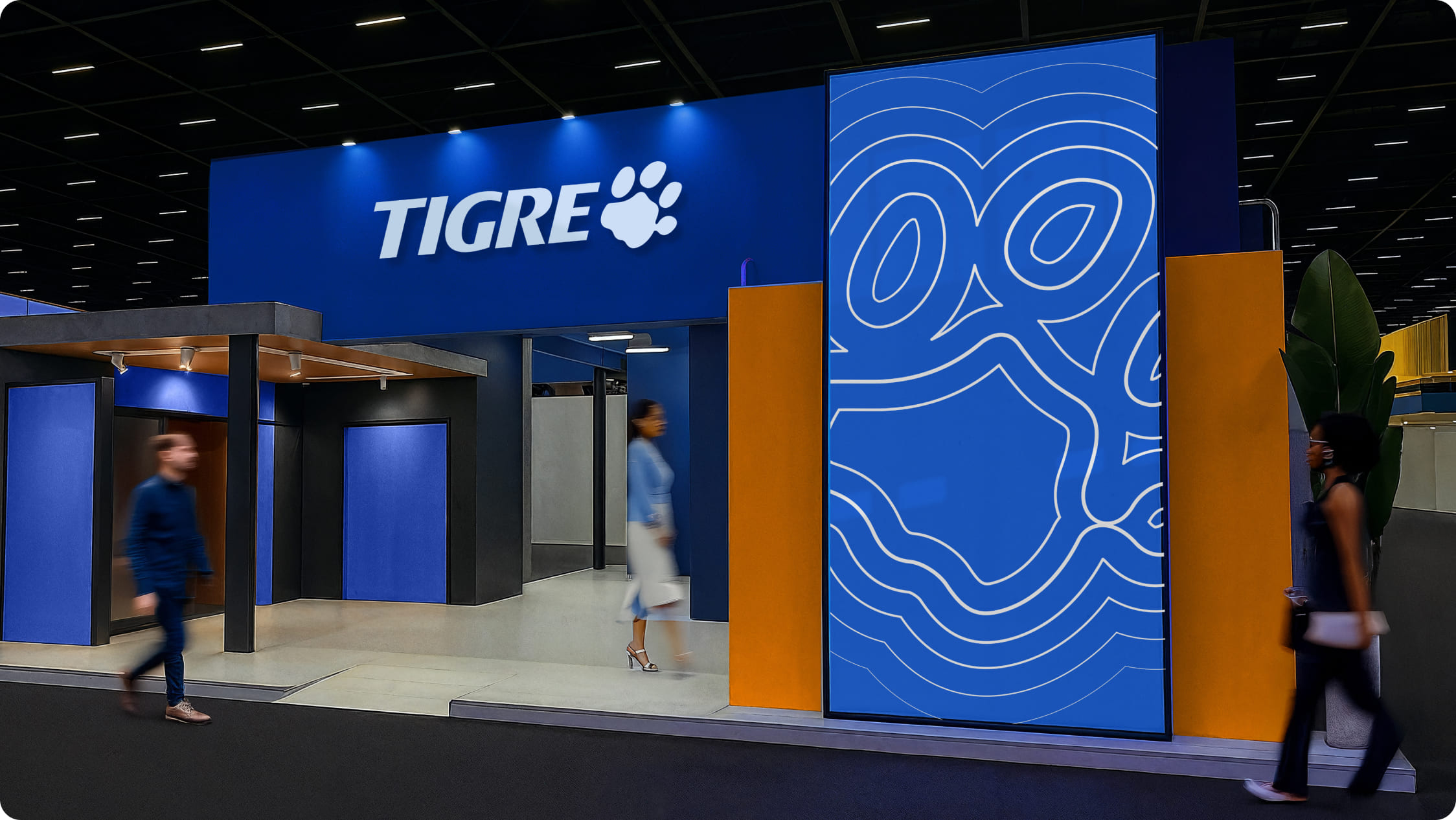
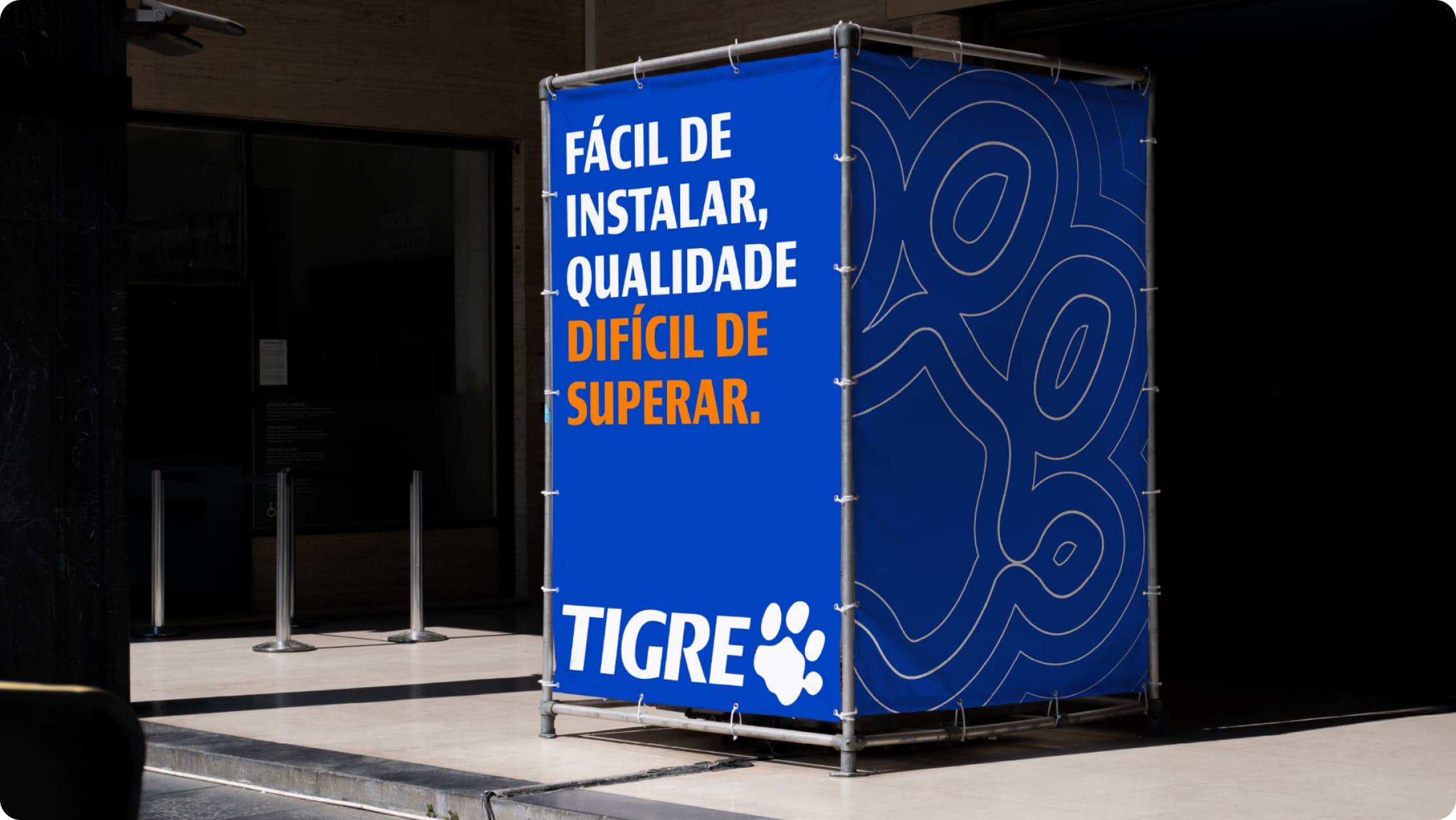
Tigre’s graphic language is built from organic, continuous shapes that evoke fluidity, connection, and movement. These elements visually express attributes such as efficiency, adaptability, and solidity, reinforcing the brand’s presence in a subtle way.
Construction
The graphic elements are derived from the geometry of the paw, the Tigre brand’s main symbol. Its curves and proportions create organic reverberations that maintain formal coherence and visual identity.
The principle
We start from the shape of the paw
It is built through the fluid repetition of shapes, creating a sense of movement and continuity. It is intended for backgrounds, large areas, and higher-impact applications.

The expansion
We are born from the paw and move forward
It complements the main graphic language and helps structure compositions, creating rhythm and visual progression within the brand’s visual universe, always starting from the paw.

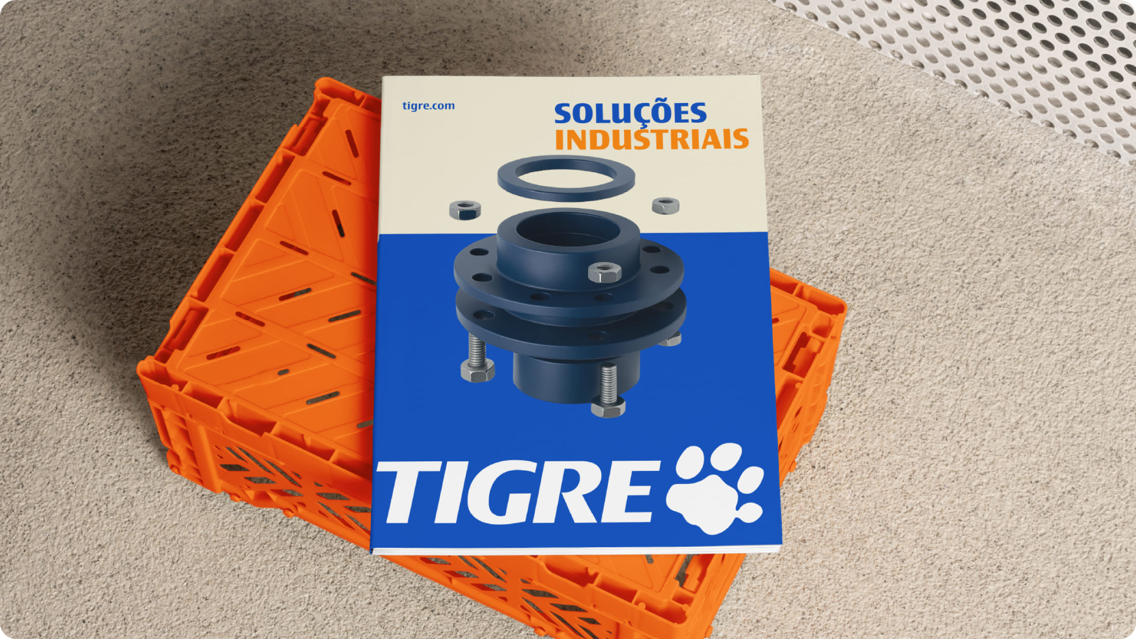
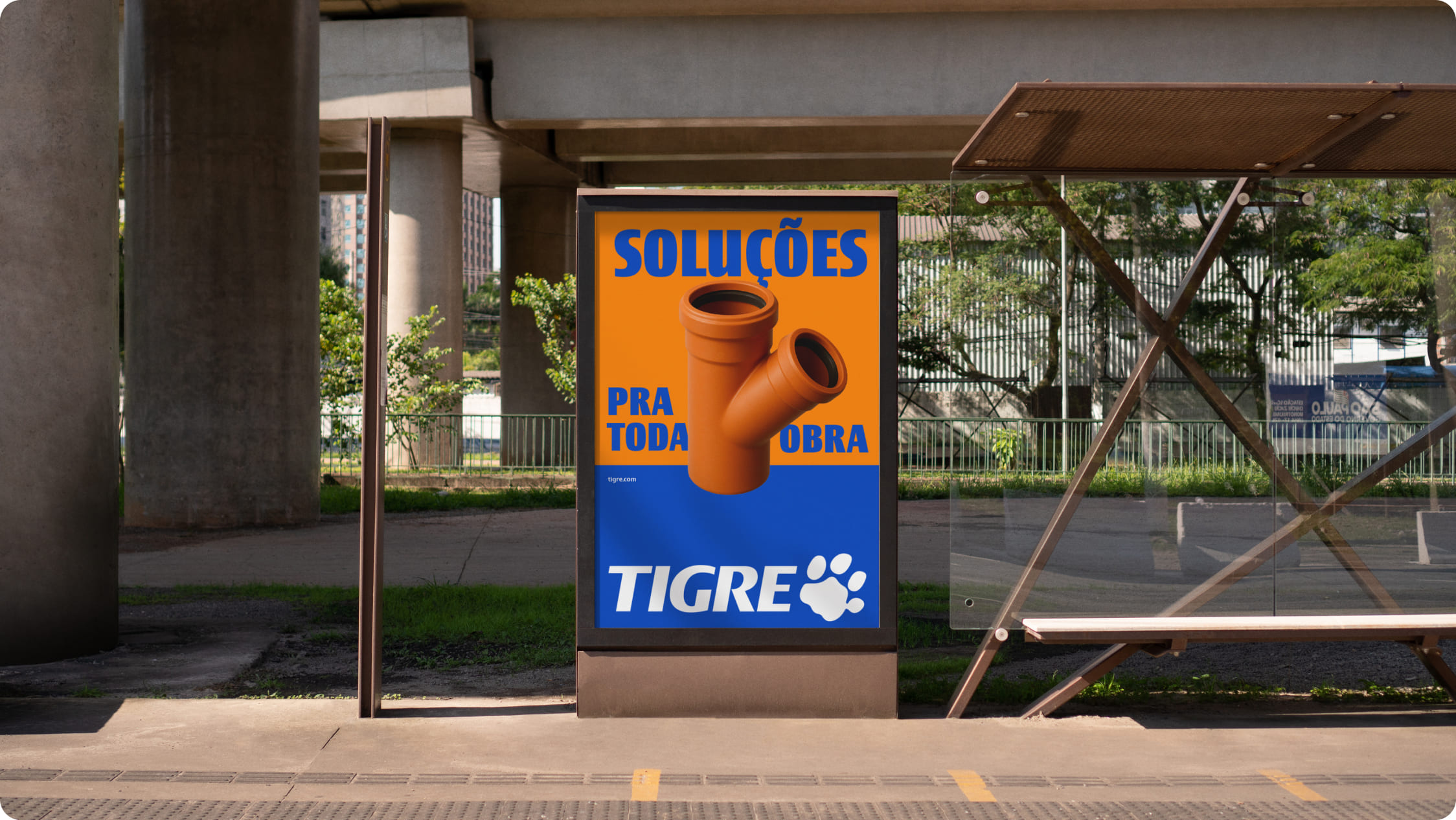
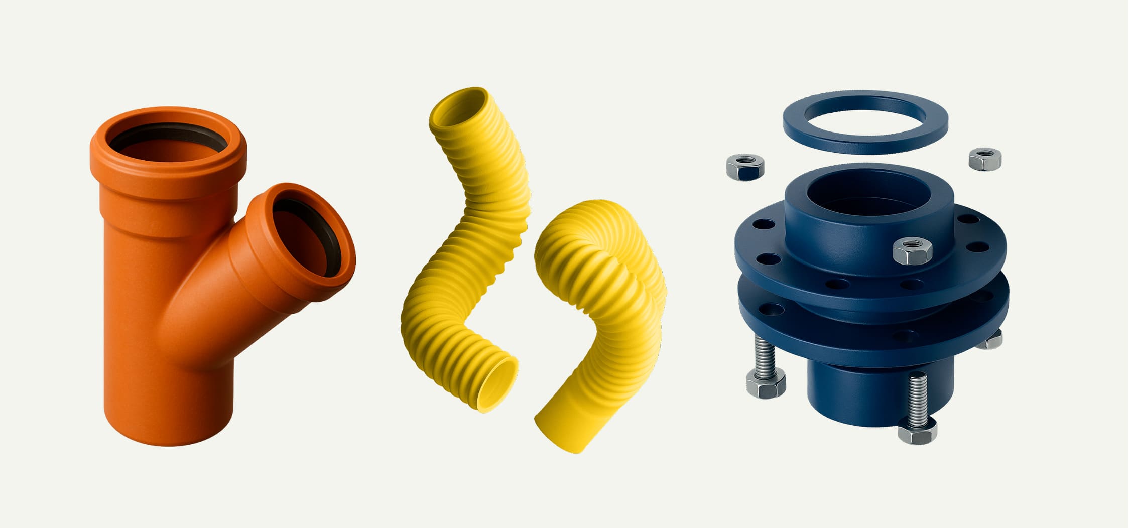
Product photography as a graphic element
Tigre product photography can be used as a graphic element, highlighting the form, purpose, and quality of each item with clarity and precision. It should reinforce technical attributes, make the product easier to understand visually, and ensure consistent brand recognition across different communication contexts.

Fotografia de produto como elemento gráfico
A fotografia de produto da Tigre pode ser utilizada como elemento gráfico e valoriza a forma, a função e a qualidade dos itens de forma clara e precisa. Ela deve reforçar atributos técnicos, facilitar a leitura do produto e garantir reconhecimento consistente da marca em diferentes contextos de comunicação.
Application examples
The examples below show correct applications of the gradient mesh in editorial and institutional materials. They illustrate how this graphic element can work alongside typography, images, and information hierarchy, reinforcing Grupo Tigre’s identity without competing with the main content.