96px
Newbery Sans Pro
Newbery Sans Pro
AaBbCcDdEe
@#$&!01234


Typography is one of the pillars of Tigre’s visual language. It acts as a structuring element of communication, ensuring clarity, hierarchy, and consistency across every brand touchpoint, from institutional materials to product applications.

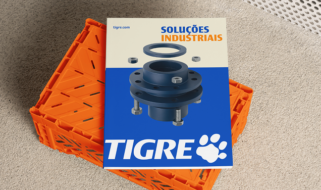
Tigre Sans is Grupo Tigre’s institutional typeface. Its contemporary design, with clean lines and balanced proportions, was developed to offer high legibility, versatility, and a distinctive personality within the brand’s visual system. It should be the primary typeface across all institutional communications, brand materials, products, and digital environments, ensuring visual unity and consistent recognition.
The range of Tigre Sans weights makes it possible to create contrast, hierarchy, and visual rhythm in compositions. Use only the weights indicated on this page, respecting their intended functions and avoiding excessive or unapproved combinations.
Our font flows.
ABCDEFGHIJKLM-ABCDEFGHIJKLM
0123456789., $€£¥&! @#%&* ()?
This is Tigre Sans Compact set in light.
This is its italic version.
Our font flows.
ABCDEFGHIJKLM-ABCDEFGHIJKLM
0123456789., $€£¥&! @#%&* ()?
This is Tigre Sans Compact set in medium.
This is its italic version.
Our font flows.
ABCDEFGHIJKLM-ABCDEFGHIJKLM
0123456789., $€£¥&! @#%&* ()?
This is Tigre Sans Compact set in bold.
This is its italic version.
Our font flows.
ABCDEFGHIJKLM-ABCDEFGHIJKLM
0123456789., $€£¥&! @#%&* ()?
This is Tigre Sans Regular set in light.
This is its italic version.
Our font flows.
ABCDEFGHIJKLM-ABCDEFGHIJKLM
0123456789., $€£¥&! @#%&* ()?
This is Tigre Sans Regular set in medium.
This is its italic version.
Our font flows.
ABCDEFGHIJKLM-ABCDEFGHIJKLM
0123456789., $€£¥&! @#%&* ()?
This is Tigre Sans Regular set in bold.
This is its italic version.
Our font flows.
ABCDEFGHIJKLM-ABCDEFGHIJKLM
0123456789., $€£¥&! @#%&* ()?
This is Tigre Sans Wide set in light.
This is its italic version.
Our font flows.
ABCDEFGHIJKLM-ABCDEFGHIJKLM
0123456789., $€£¥&! @#%&* ()?
This is Tigre Sans Wide set in medium.
This is its italic version.
Our font flows.
ABCDEFGHIJKLM-ABCDEFGHIJKLM
0123456789., $€£¥&! @#%&* ()?
This is Tigre Sans Wide set in bold.
This is its italic version.
When the institutional typeface cannot be used, Verdana may be used as the supporting typeface.
Because it is natively available across many operating systems, it should be used in HTML-based materials such as email signatures, in documents that will be opened by third parties such as spreadsheets and presentations, or when software limitations apply.
ABCDEFGHIJKLM—ABCDEFGHIJKLM
0123456789., $€£¥&! @#%&* ()?
This is Verdana Regular in a medium title.
This is the Italic version.
ABCDEFGHIJKLM—ABCDEFGHIJKLM
0123456789., $€£¥&! @#%&* ()?
This is Verdana Regular in a medium title.
This is the Italic version.
Within Tigre’s visual language, typography is part of the composition as it interacts with other graphic elements, and that interaction must always follow basic composition rules to always ensure coherence.
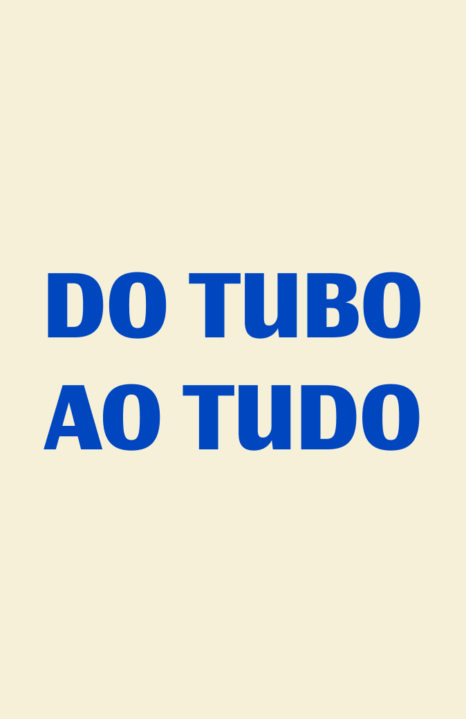
Hierarchy between pieces of information is essential for clear and effective communication.
Typographic compositions should be intentional, with noticeable contrast between titles, subtitles, and longer text blocks. Reading order should always be considered, and sizes should create a clear visual distinction between different levels of information.
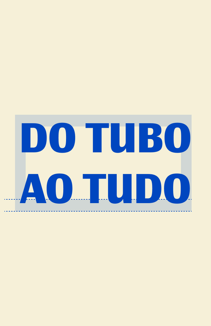
Use Tigre Sans Bold,always highlighting the main message. Size (ref): 92 pt
Use Tigre Sans Regular.
Size (ref): 40 pt
Use Tigre Sans Regular.
Size (ref): 24 pt
Use Tigre Sans Wide.
Size (ref): 16 pt
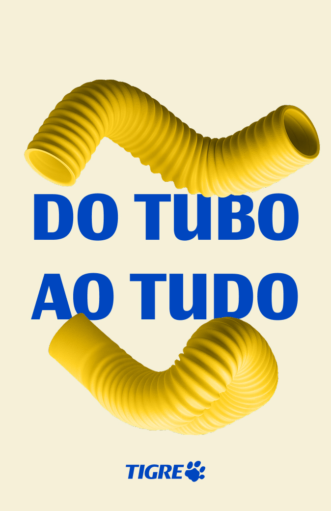
Below are tips and suggestions for compositions aligned with the brand’s principles.