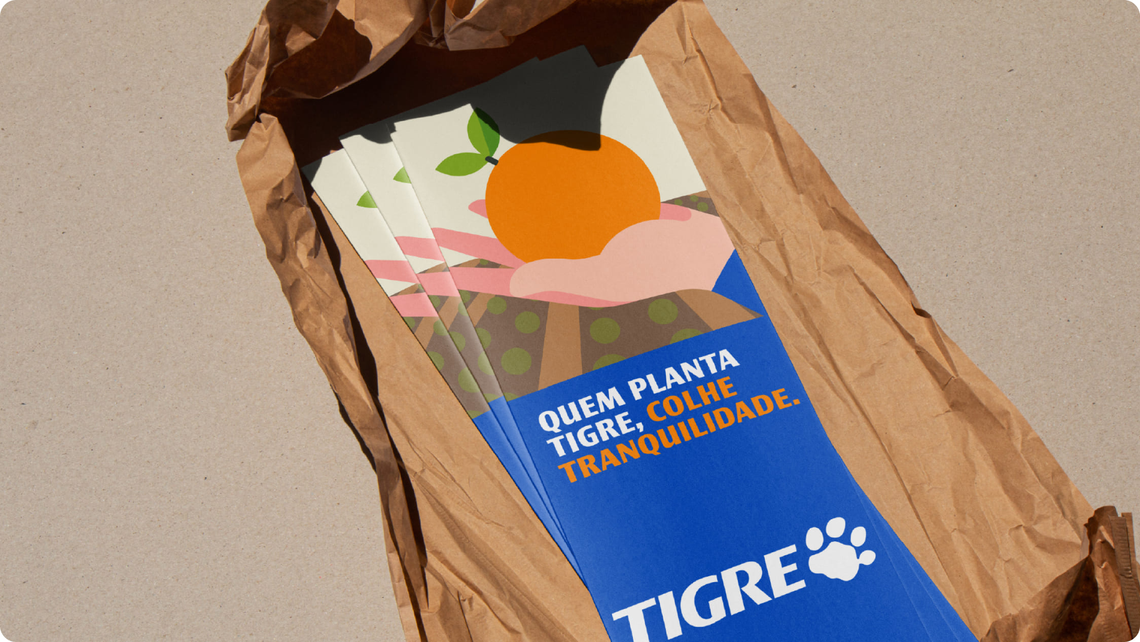
Illustrations
Tigre illustrations complement the brand’s visual language and support communication in a clear, accessible, and consistent way. They help explain concepts, processes, and everyday situations, always aligned with the brand identity.

Concept
Tigre’s illustration system uses simplified shapes and institutional colors to communicate technical content in a direct and easy-to-understand way. Its use should reinforce message clarity without competing with other compositional elements.


Our style
Tigre’s illustration style is clean, functional, and consistent. It prioritizes quick reading, proper contrast, and formal simplicity, avoiding excessive detail or decorative effects.
Simple forms
Clear, well-defined geometries that ensure easy reading at different scales.

Institutional colors
Exclusive use of the brand palette, respecting contrast and hierarchy.

Characters and objects
A synthetic and balanced representation, without caricature or exaggeration.

Themes
Illustrations should address themes related to the use of products and solutions in Tigre’s real application contexts, always focusing on functionality and clarity.


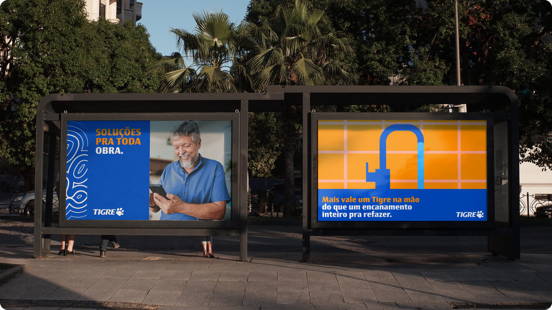
Application examples
The examples below show correct applications of Tigre illustrations and serve as a reference for maintaining consistency and alignment with the brand identity.