EN

Creative direction for spaces
In this chapter, you will learn about the Creative Concept and the 4 Design Principles that will serve as a compass for creating GRUPO TIGRE and TIGRE spaces, guiding choices such as: shapes, materials, textures, finishes, furniture, lighting, and other resources that consolidate into a consistent, robust language aligned with the brand's personality.

Creative concept
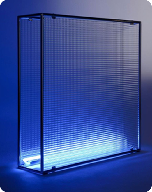
Tigre World: Solidity you can see through
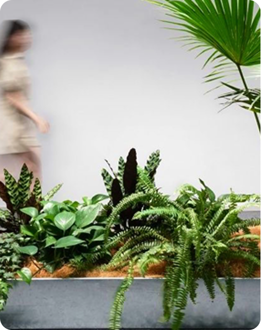
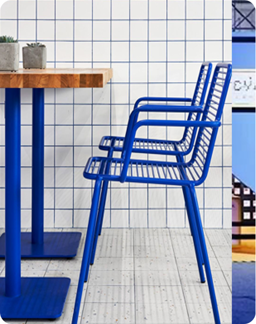
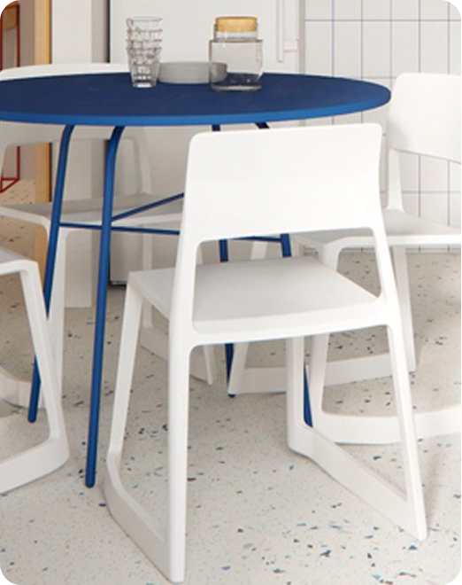
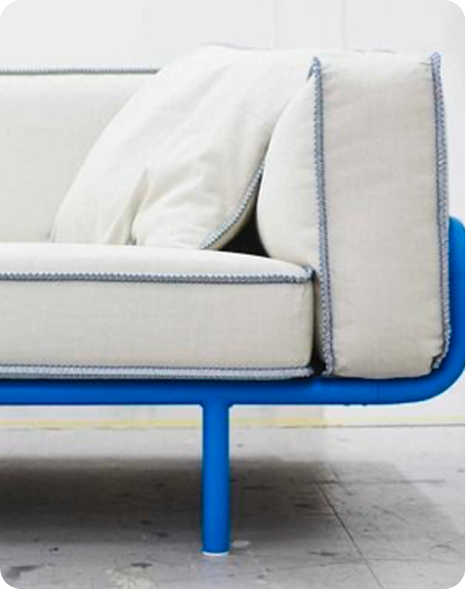
Here, quality does not need to be announced; it reveals itself through visual impact, atmosphere, and experience. Vibrant spaces spark curiosity, invite exploration, and turn every corner of the environment into a discovery. A journey designed to inspire, educate, and create positive connections, building trust and a vision for a better future.
Design principle
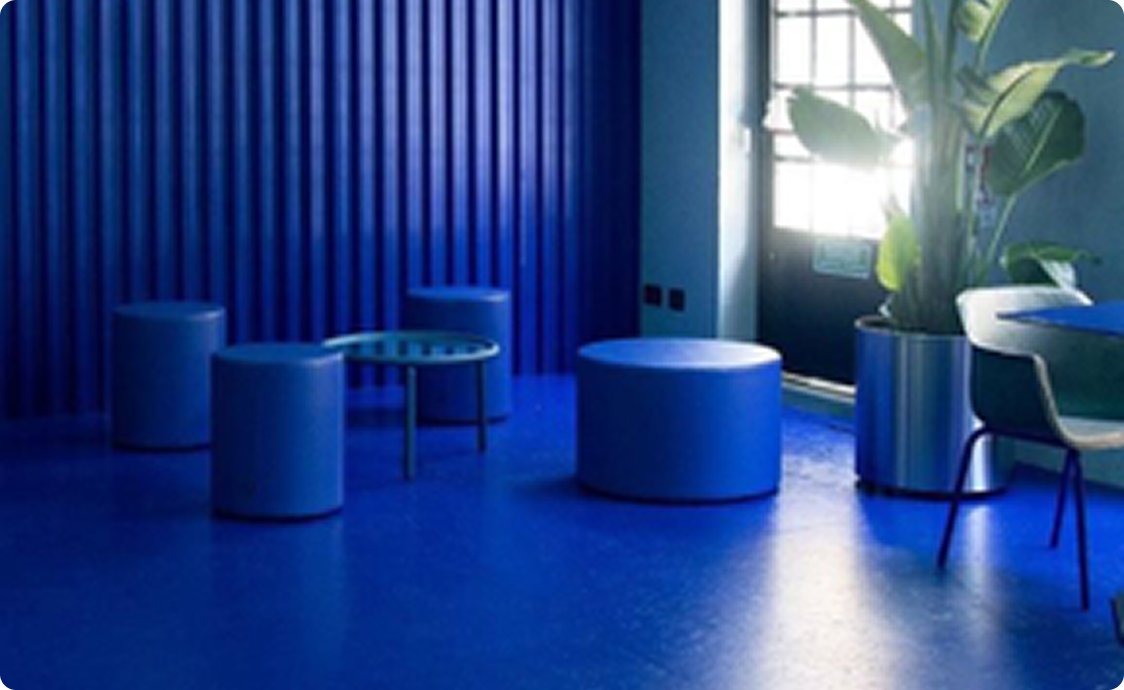
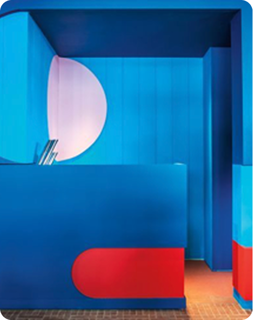
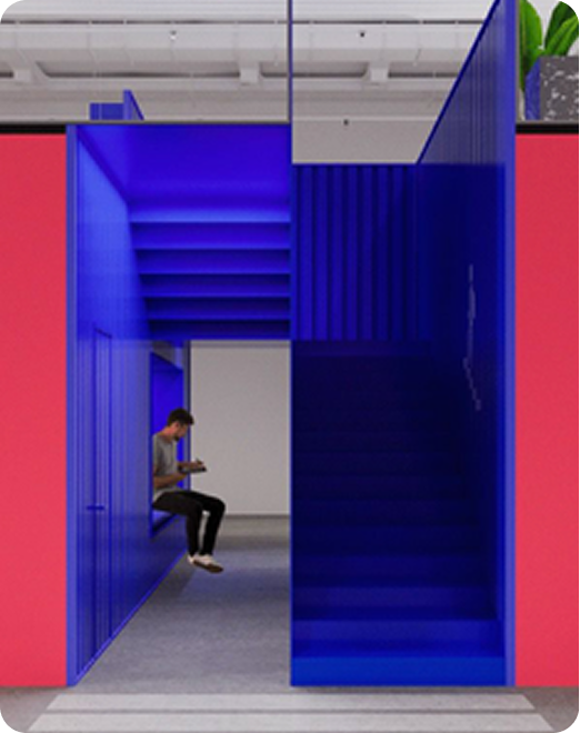
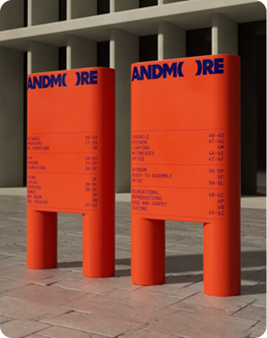
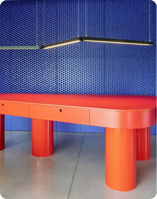
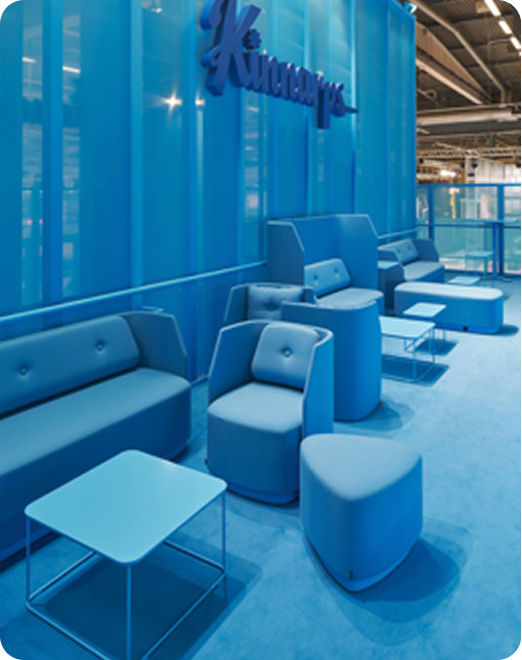
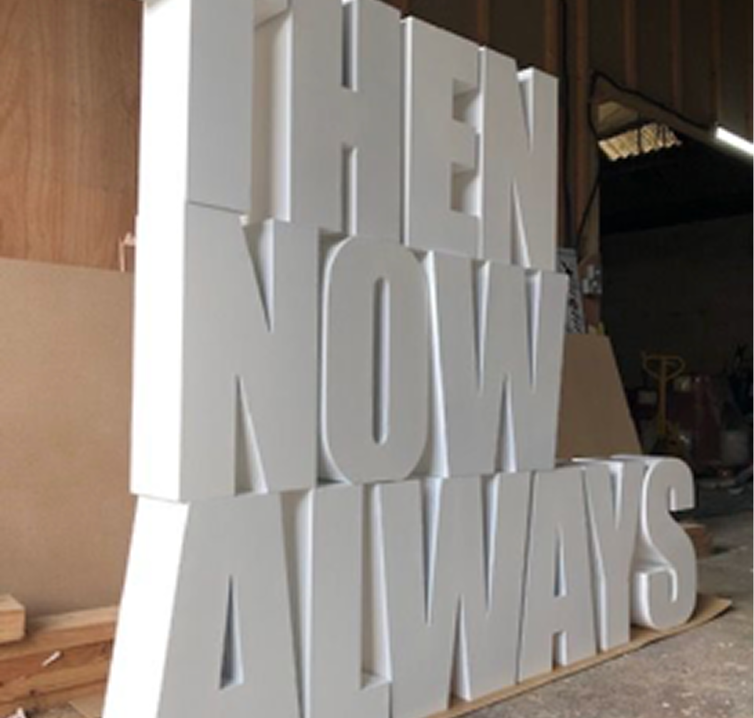
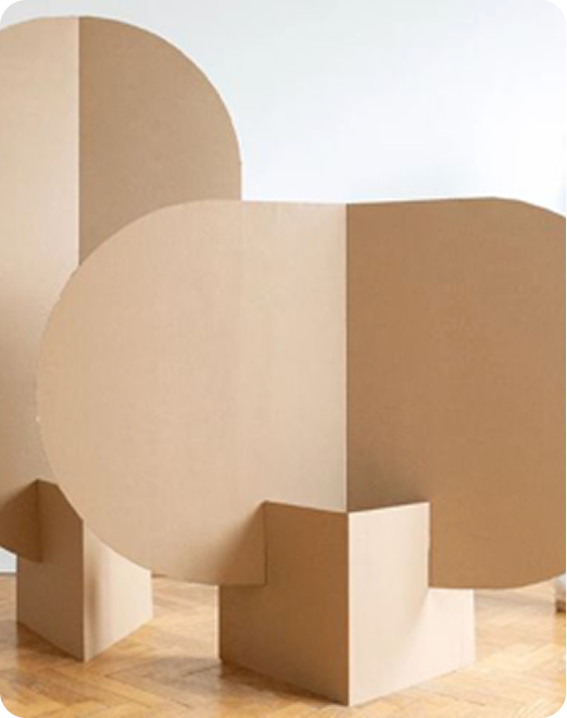
Empowering presence

Design principle
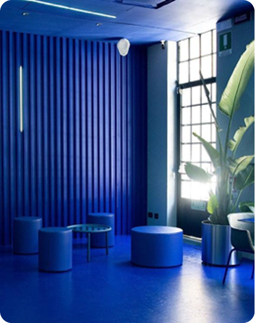
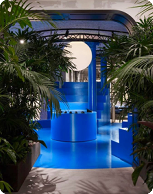
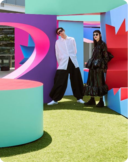
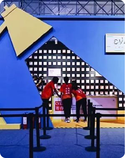
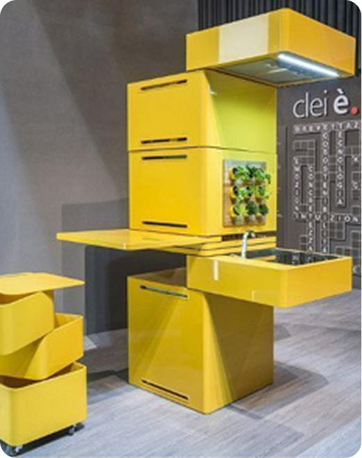
Intelligence that evolves

Design principle
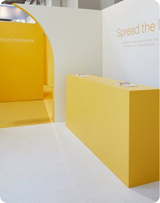
Simplicity that makes life easier

Design principle
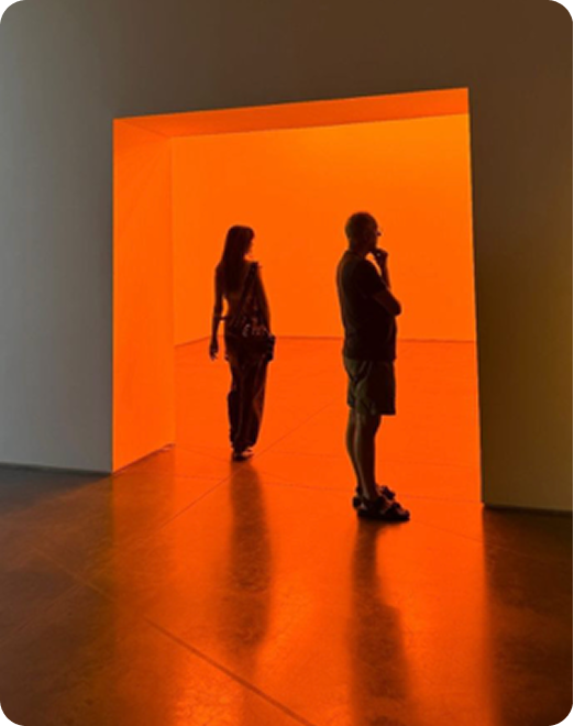
Connection that brings people together