

Brand
The Tigre product brand is the company’s main expression in its direct relationship with consumers. It brings together the values of quality, innovation, and trust that have established Tigre as a reference in its category, ensuring immediate recognition and consistency across all product lines.
Brand in use
Its design and usage rules were created to ensure legibility, presence, and integrity, regardless of the medium or scale of application. For that reason, all the decisions presented below must be followed as an essential part of building and maintaining the brand over time.


The brand
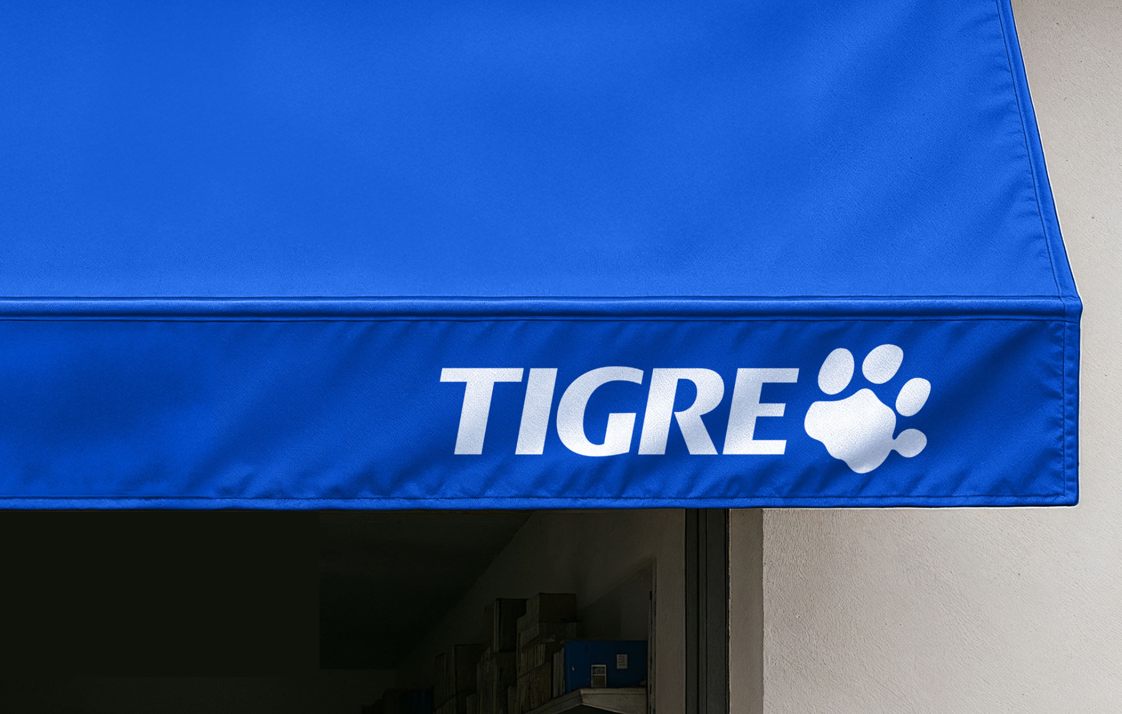
The Tigre logo was designed to ensure legibility, presence, and recognition across different environments, especially on products and packaging. Its construction prioritizes formal simplicity and visual impact, allowing for consistent applications across different scales and materials.

Brand versions
The Tigre brand has specific color versions for different uses. Whenever possible, the positive version should take priority, while the reverse version is intended for dark backgrounds or those with greater visual density.
Positive version
Primary version for light backgrounds
This is the brand’s primary version, recommended for light, uniform backgrounds, as it ensures contrast, legibility, and institutional recognition.

Reverse version
Primary version for dark backgrounds
Recommended for dark backgrounds or those with greater visual density, it ensures clear legibility and preserves the integrity of the logo.

Symbol
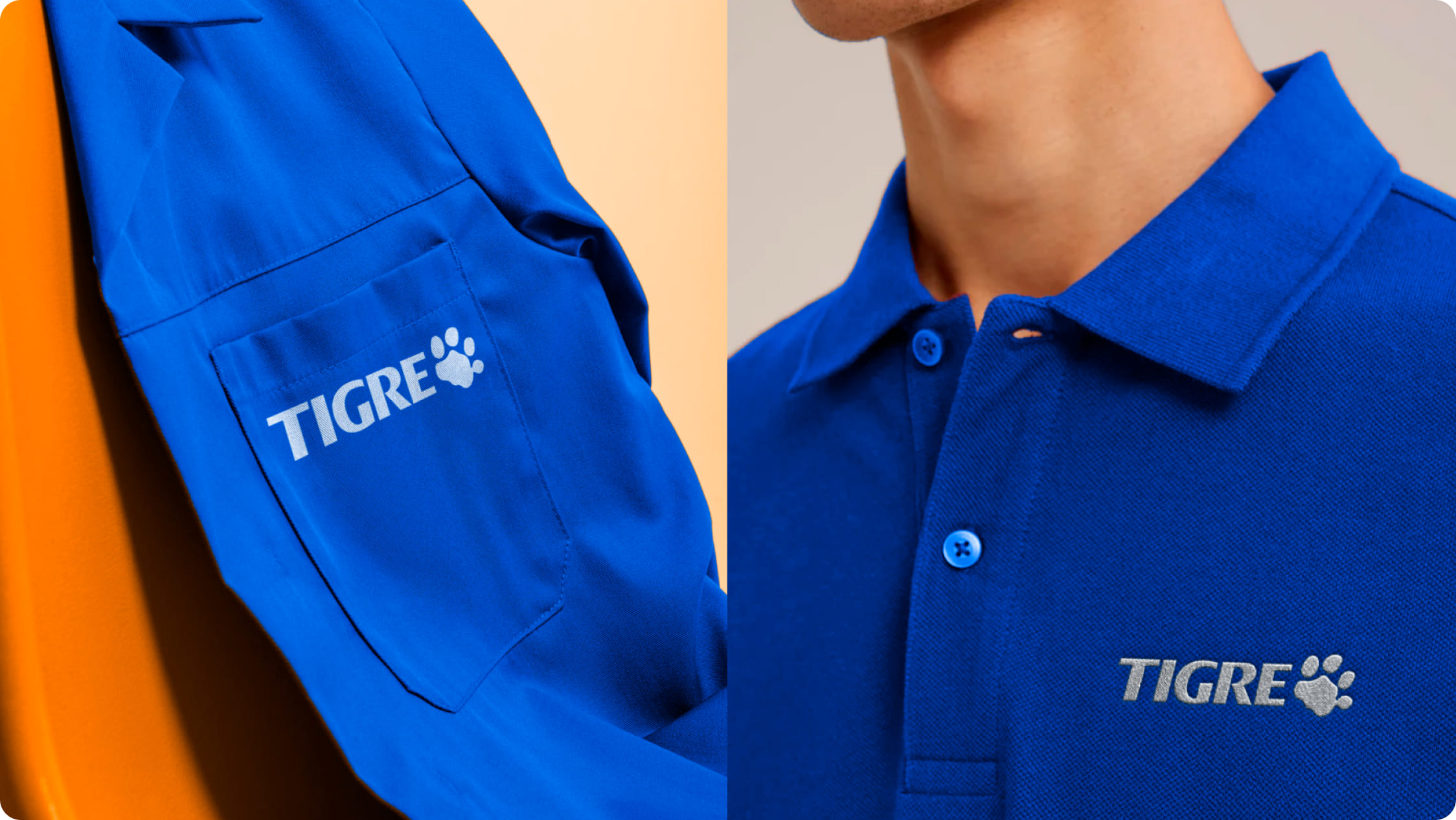
The Tigre brand symbol is a supporting element of the brand identity and must always be used together with the Tigre logo. It must not be used on its own in compositions. The paw visually reinforces the brand, preserves its formal attributes, and expands recognition when integrated with the Tigre name, even at small sizes.
The paw
The paw is the graphic symbol of the Tigre brand. It works as an element of immediate recognition and reinforces the identity’s distinctive character, both as a visual signature and as a supporting resource in specific applications.

Position
The placement of the Tigre brand must respect a minimum clear space equivalent to 5% of the composition’s largest dimension, whether width or height. This margin serves as required clear space, ensuring the brand’s legibility, prominence, and visual integrity within each composition.
Centered
Recommended for institutional pieces, covers, packaging, and higher-impact applications. Centered alignment reinforces prominence and visual balance.

Stacked
Recommended for vertical formats or narrow areas. This option makes better use of space and preserves legibility.

Horizontal
The horizontal application is best suited to wide layouts and landscape formats. It favors continuous reading and integrates well into broader grid systems.

Reduction
The brand must not be reduced below the minimum size required for legibility. Applications below that limit compromise recognition and visual clarity.


Protection area
The protection area establishes the minimum space around the brand, ensuring that no other element interferes with its legibility.
Product brand
The protection area of the brand is proportional to the size of the logo’s paw and defines the minimum space around the design, ensuring legibility and prominence in any application.

Paw
The protection area for the paw is defined based on its largest compositional module and ensures that the element maintains clarity and prominence within the composition.

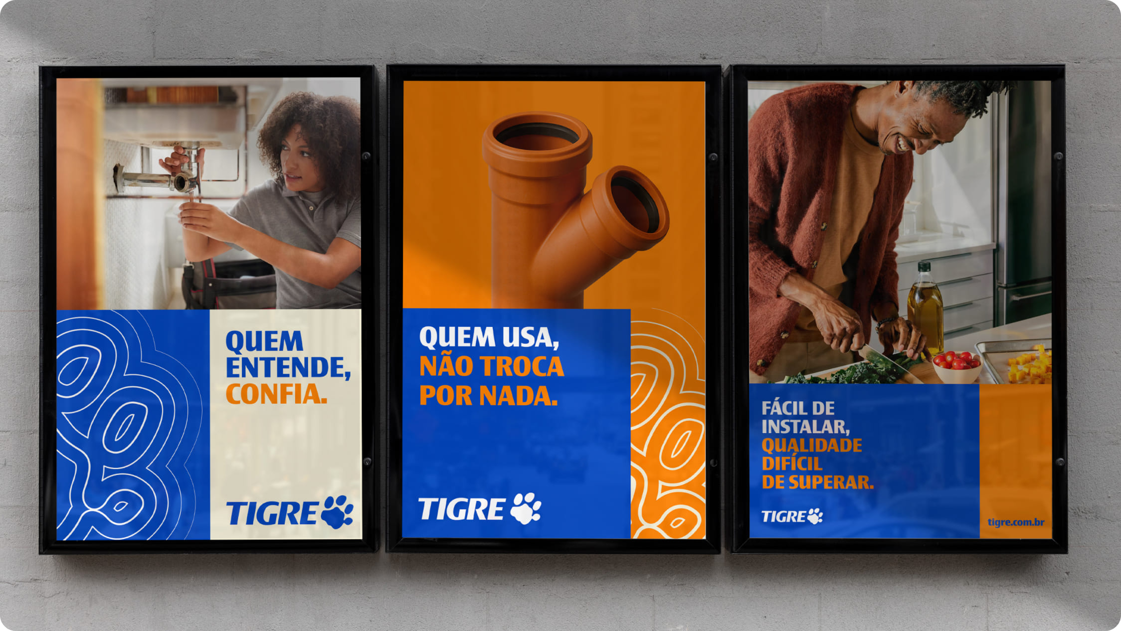
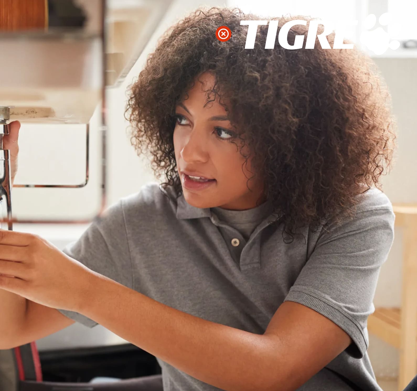
Brand over images
When applying the Tigre brand over images, contrast and legibility must be ensured. Areas with less visual noise should be prioritized, and when needed, the appropriate color versions should be used.

Use on color backgrounds
Grupo Tigre’s institutional colors reinforce the identity and visual consistency of the system. The brand must always be applied in line with the defined palette to ensure proper contrast against the background.
Examples
The examples below show correct applications of the Grupo Tigre brand in graphic compositions and serve as a reference for maintaining consistency and brand recognition.

Incorrect uses
To preserve the strength and consistency of the brand, some uses must be avoided under all circumstances:


