Brand

The Grupo Tigre brand is the system’s main asset for recognition and consistency. More than a graphic element, it brings credibility, organization, and clarity, reflecting the company’s institutional stance across every touchpoint.

Brand in use
Its design and usage rules were created to ensure legibility, presence, and integrity, regardless of the medium or scale of application. For that reason, all the decisions presented below must be followed as an essential part of building and maintaining the brand over time.


The brand
The Grupo Tigre logo was designed to work clearly, objectively, and recognizably in different contexts. Its construction balances institutional strength with formal simplicity, allowing it to be applied consistently in both digital and physical environments.

Brand versions
The brand has specific versions for different uses. Each one was designed to ensure legibility, adapt to the available space, and maintain visual consistency.
Positive version
Primary version for light backgrounds
This is the brand’s primary version, recommended for light, uniform backgrounds, as it ensures contrast, legibility, and institutional recognition.

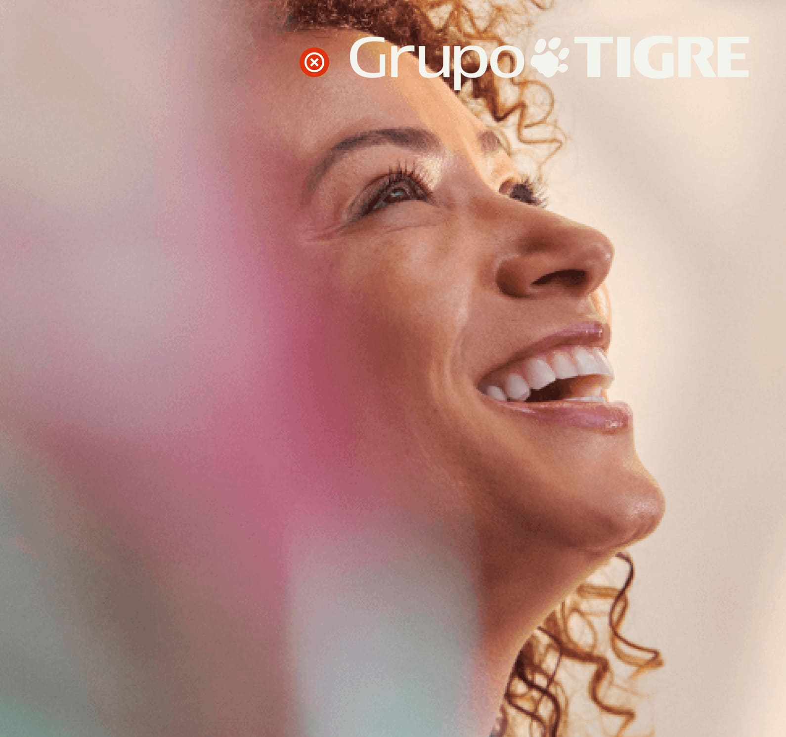
Reverse version
Primary version for dark backgrounds
Recommended for dark backgrounds or those with greater visual density, it ensures clear legibility and preserves the integrity of the logo.

Symbol
The Grupo Tigre icon is a visual synthesis of the brand, designed for contexts where the full logo cannot be used. It preserves the identity’s main formal attributes and remains recognizable even at small sizes.
The paw
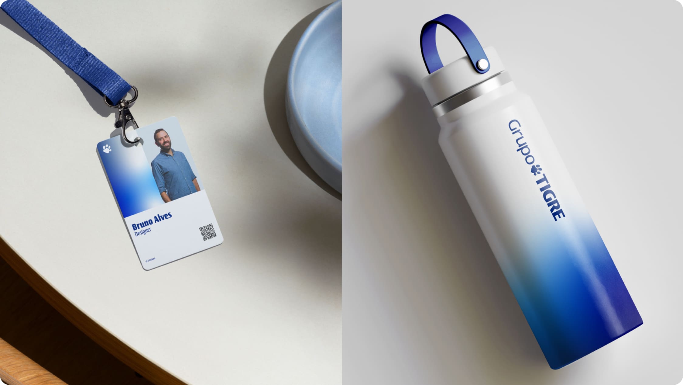
The paw is a cross-cutting element in Grupo Tigre’s visual language and appears consistently across all communication, from the institutional level to product brands. Its form synthesizes the identity’s main attributes and works as an instantly recognizable sign.

Position
The position of the brand directly affects its readability and visual impact. To ensure consistency, the logo must be applied according to clear and predictable alignments within the composition. In addition, layout margins should be proportional to the size of the logo’s paw; for that reason, always use the original files for reproduction.
Centered
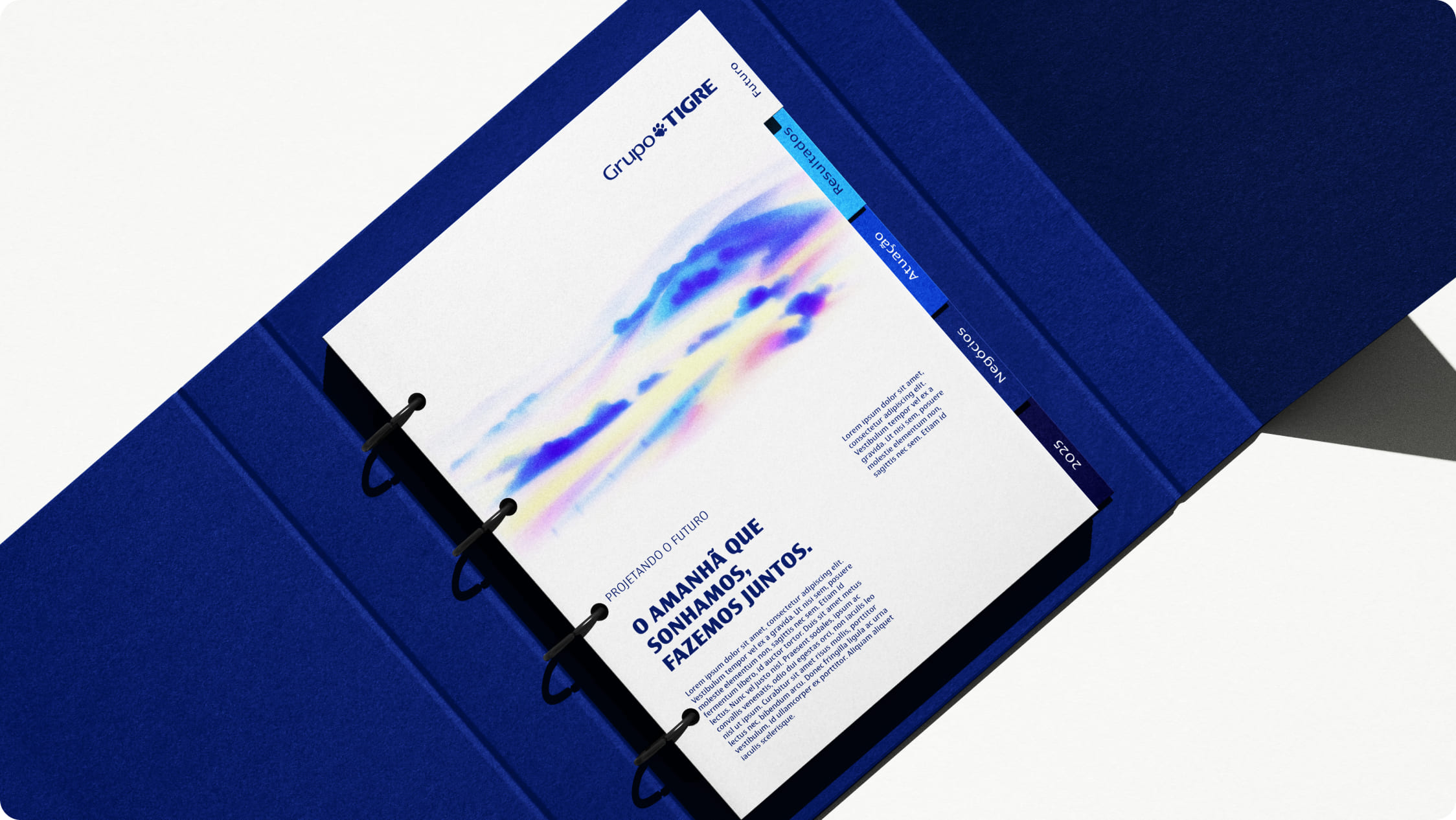
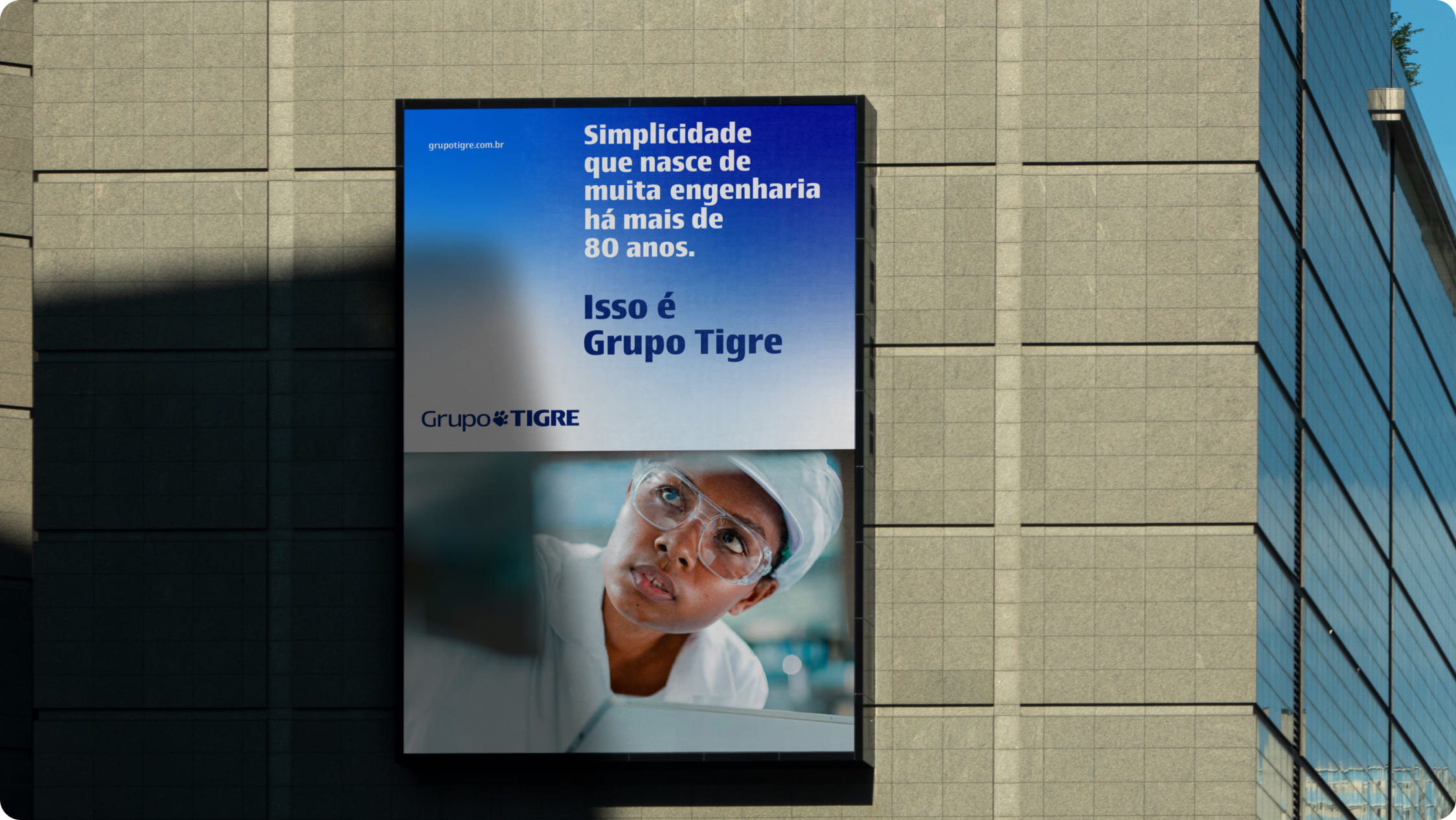
Centered placement is recommended for institutional pieces, covers, openings, and higher-impact communications. This application reinforces the brand’s prominence and conveys visual balance.

Stacked
The stacked application is recommended for supports with a predominantly vertical orientation or narrow areas. This version makes better use of space and preserves logo legibility.

Horizontal
The horizontal application is best suited to wide layouts and landscape formats. It favors continuous reading and integrates well into broader grid systems.

Brand over images
When the logo is applied over images, it is essential to ensure legibility. Areas with greater contrast and lower visual noise should be prioritized.

Reduction
The brand must not be reduced below the minimum size required for legibility. Applications below that limit compromise both recognition and visual clarity.


Protection area
The protection area establishes the minimum space around the brand, ensuring that no other element interferes with its legibility. To define the protection area correctly, always use the original files as the basis for construction.
Group brand
The protection area for the product brand is defined based on the size of the paw within the composition and establishes the minimum space around the logo, ensuring legibility and visibility in any application.

Paw
The protection area for the paw is defined based on its largest compositional module and ensures that the element maintains clarity and prominence within the composition.

Use on color backgrounds
Grupo Tigre’s institutional colors reinforce the identity and visual consistency of the system. The brand must always be applied in line with the defined palette to ensure proper contrast against the background.
Examples
The examples below show correct applications of the Grupo Tigre brand in graphic compositions and serve as a reference for maintaining consistency and brand recognition.
Incorrect uses
To preserve the strength and consistency of the brand, some uses must be avoided under all circumstances: