Graphic Elements
Grupo Tigre’s graphic elements expand the brand’s visual identity and reinforce its attributes in a sensory, contemporary way. They act as extensions of the brand, helping create unity, dynamism, and recognition across different contexts and media.

Concept
Grupo Tigre’s graphic language is based on the movement of water, fields of color, and shifts in intensity that express motion, continuity, and transformation. These elements visually express the brand’s ability to evolve, connect, and create impact over time.
Gradient mesh
The gradient mesh is one of the brand’s main graphic elements. Built from the institutional palette, it allows controlled variations in color and luminosity, creating depth and fluidity based on the principles of transformation, expansion, and reverberation.
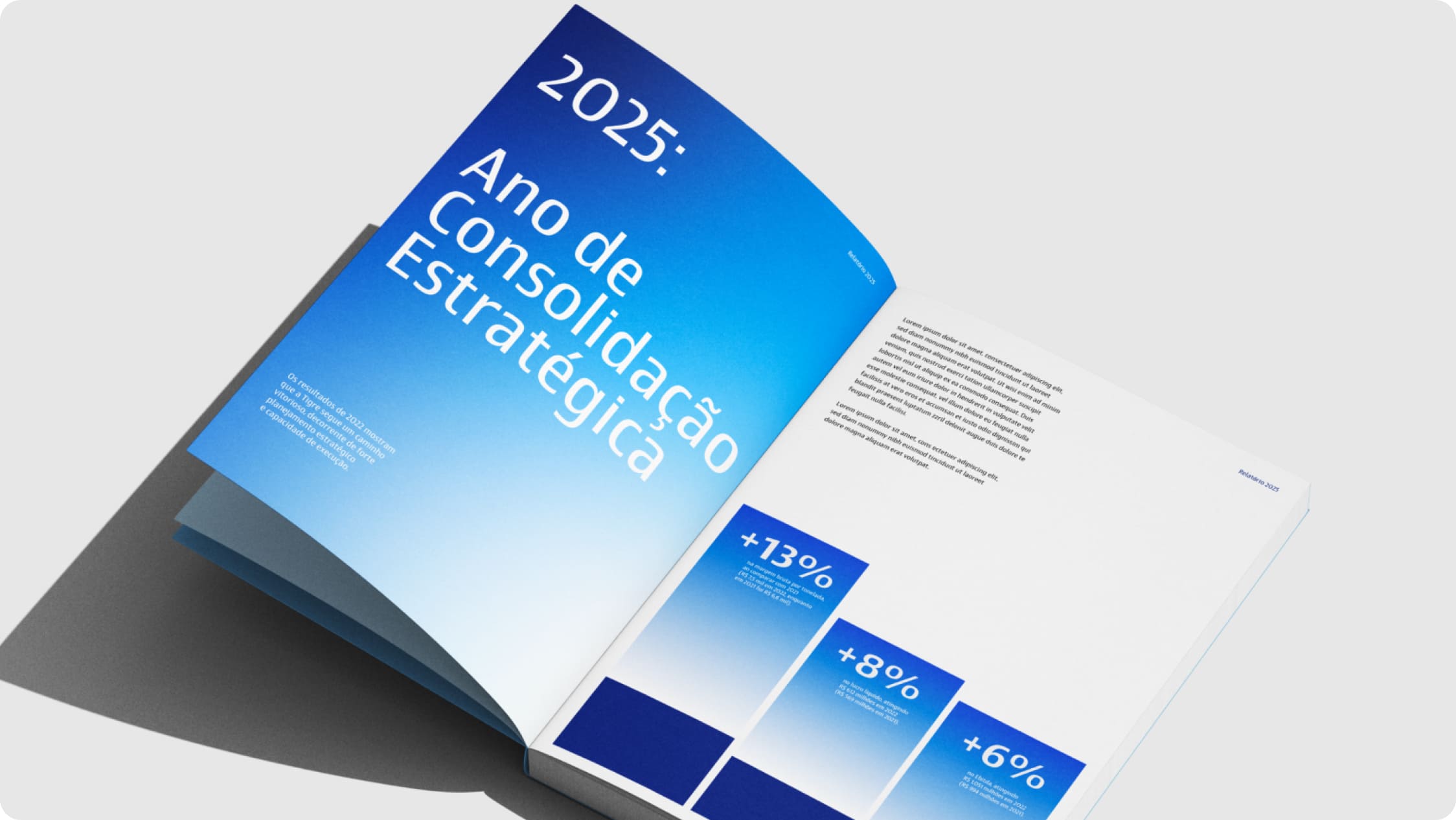
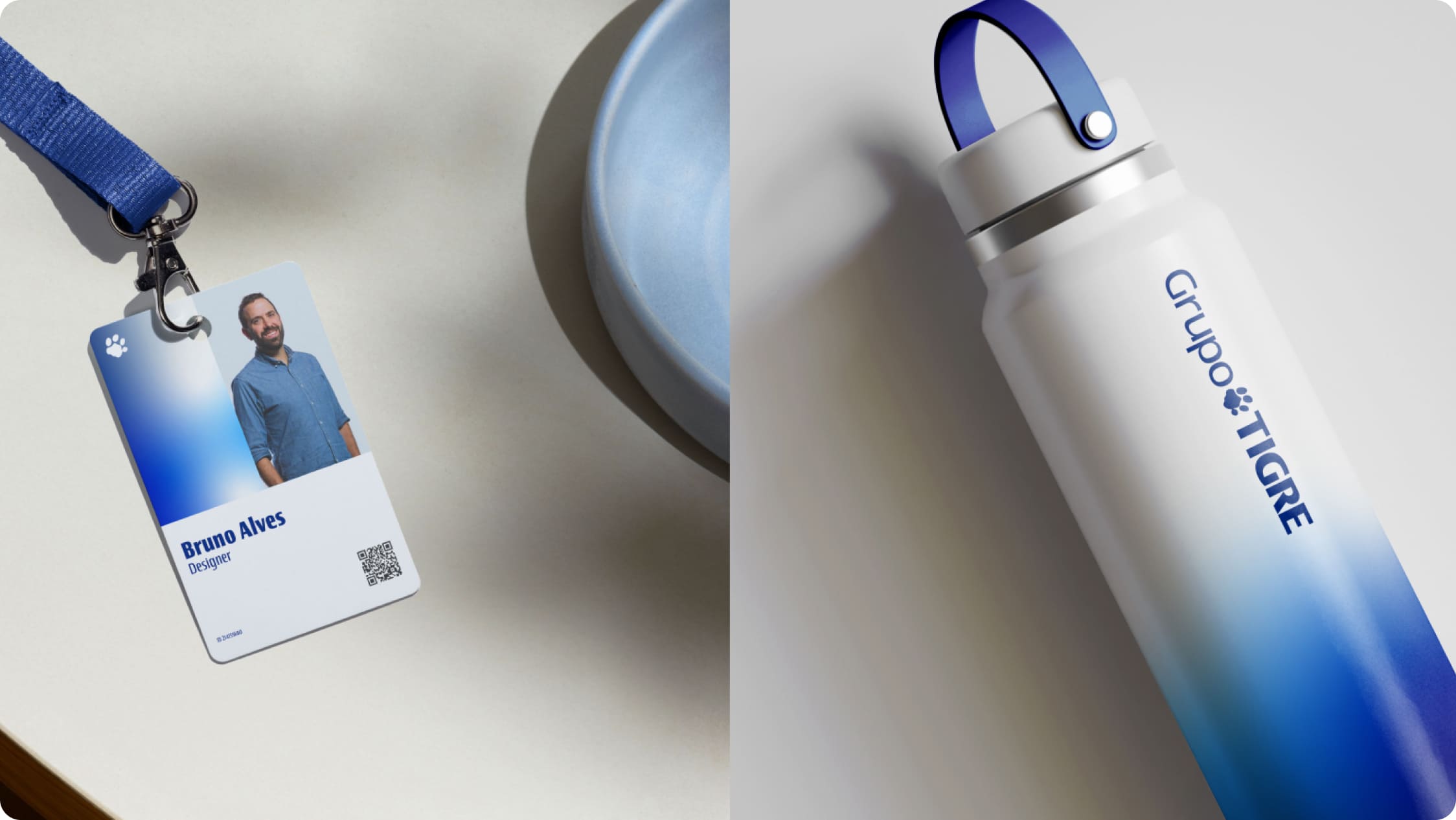
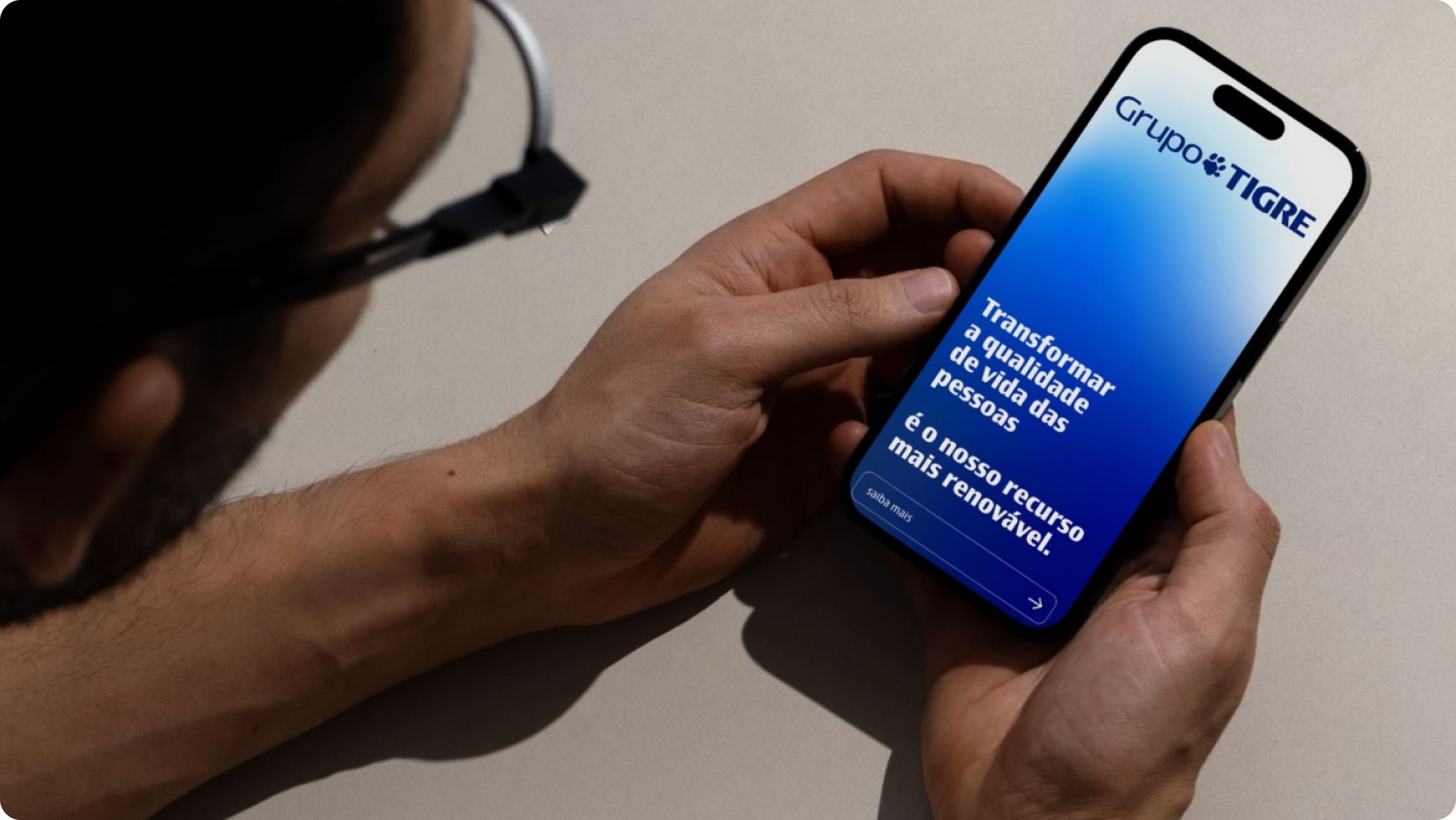
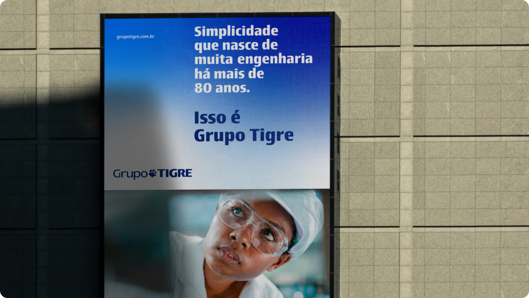
Applications examples
The examples below show correct applications of the gradient mesh in editorial and institutional materials. They illustrate how this graphic element can work alongside typography, images, and information hierarchy, reinforcing Grupo Tigre’s identity without competing with the main content.